Much of the work we do here at Barrel involves helping ecommerce brands grow their businesses online. This often includes everything from content development to website redesigns and optimization to digital marketing.
While the websites range in complexity and the products are rarely the same, there is always overlap in the elements necessary to create an effective product page experience. The product page is more than just a place to talk about the product’s details, it is an opportunity. An opportunity to tell the brand story, an opportunity to paint a picture about the lifestyle one can attain by purchasing that product, an opportunity to showcase the features that truly make this product unique.
In many cases, users will arrive at the product page through another page on the website, a Google search, an ad on social media, a friend’s recommendation, or a PR piece. Whether their intent is to buy or browse, it is our job to not only educate them but provide them with content that will make a lasting impression. While this might sound overwhelming at first, do not fear! To get you started, here is a list of the top 10 elements for building an effective ecommerce product page experience.
1. A Descriptive Product Name
This might sound like a no-brainer but you’d be surprised what people come up with when it comes to naming their products. The main takeaway here is to keep it simple! Avoid fluffy language. It’s important to make sure customers fully understand what the product is so they don’t have to do unnecessary digging. While it’s okay to have fun with product naming, it shouldn’t distract from understanding what the product is.
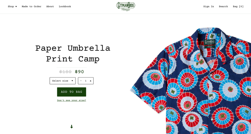
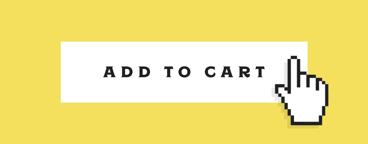
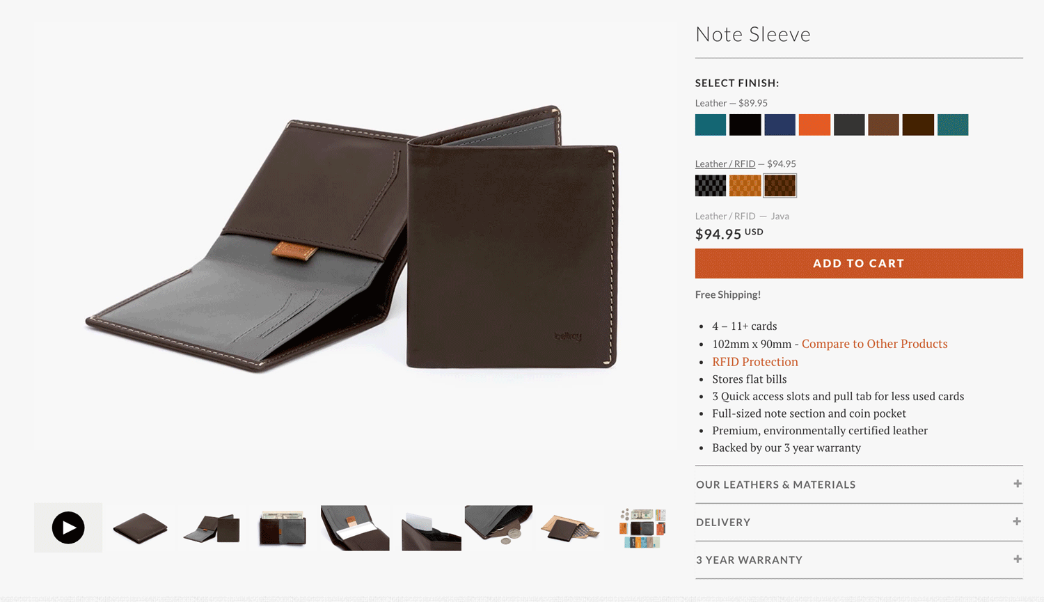
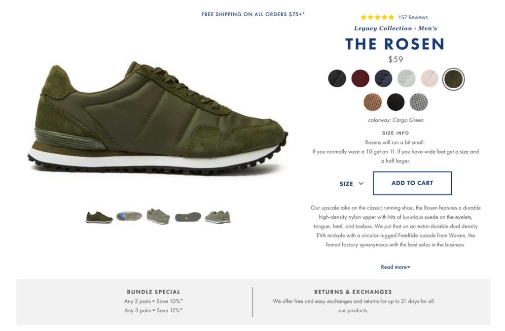
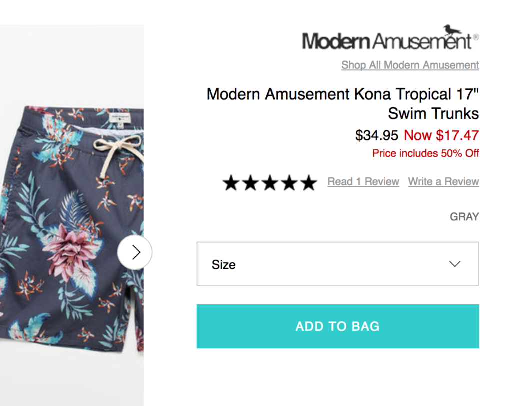
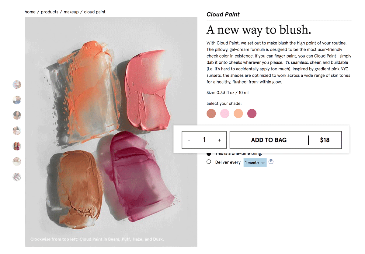
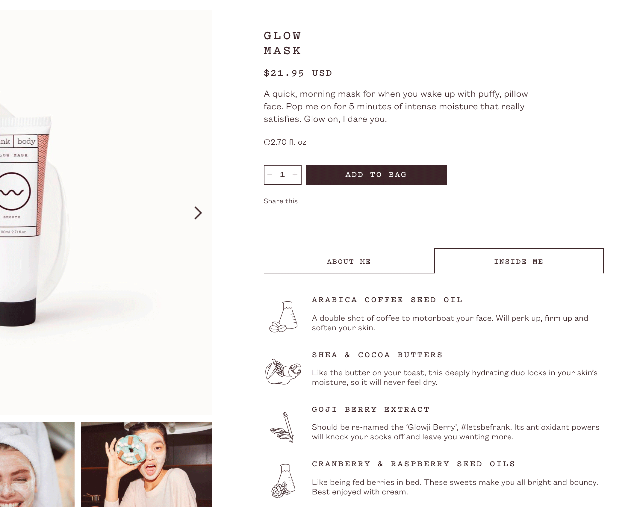
2. A Prominent “Add to Cart” Button
While we all know the “Add to Cart” button is a must-have, the prominence of it is just as important. Every website has a brand system but the “Add to Cart” button is an area that should retain its prominence, even if the look and feel is “lots of white space and minimal”. When a user lands on the product page, there should be no confusion as to whether the website is purely educational or sells product and when they decide to purchase, they should have no trouble knowing where to click.
Here are some tips for creating a prominent “Add to Cart” button:
- Stick with a filled button, outlined buttons tend to get lost and don’t draw a user’s attention.
- For longer product pages, consider a fixed navigation or slide out when a user scrolls past the button. This will help them get right back to the purchase area when they’re ready to buy.
- Keep the placement of the button near the product and details. It may look more unique to put it somewhere else but confusing placement may sacrifice sales.
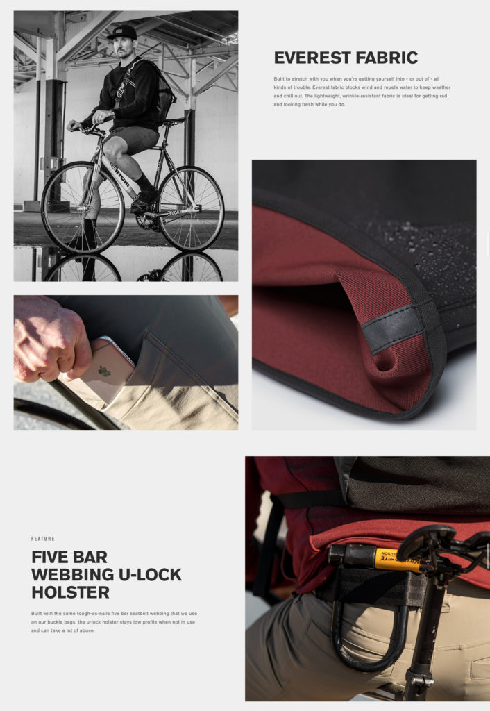
3. Strategic Product Photography
As ecommerce continues to grow every day, people now expect to experience products from the comfort of their own home, as if they were right there in-store. This is where product photography can play a major role. No matter what you’re selling, it’s important to think about what types of imagery will be most useful to the customer.
- Is the application of the product important? Would it be helpful to see the product on a model?
- Are any of the product’s features worth visualizing? (e.g. waterproof technology, hidden pocket)
- Does scale matter?
It’s the answers to questions like these that can help guide what direction to take on a product pages’ photography and can ultimately help someone decide to choose your product over another. Tip: If you have UGC (user-generated content) from social, this is a great addition to your product photography and can go a long way in helping customers see the product in action.
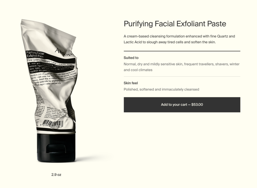
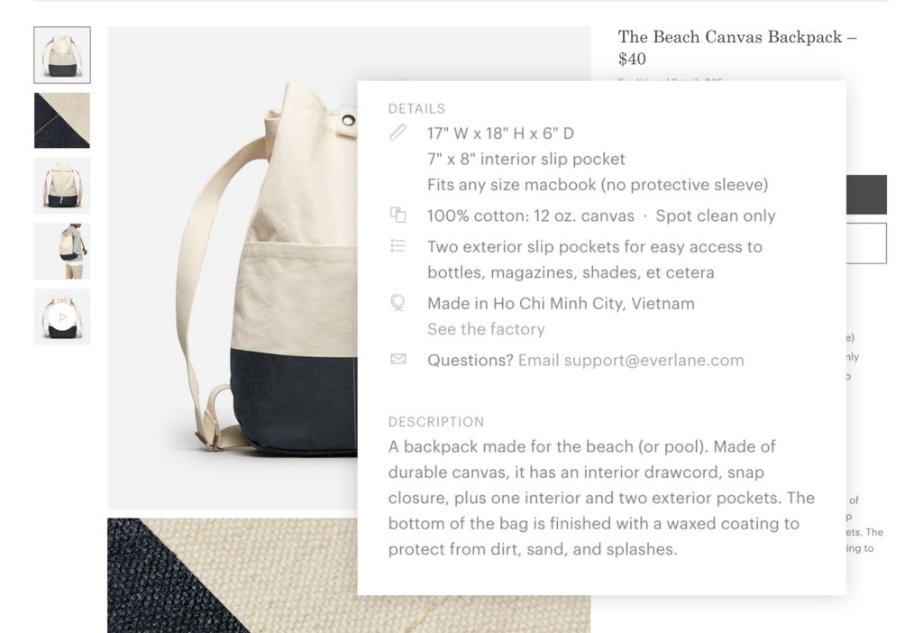
4. An Informative Product Description
Much like the product name, the product description is a given but plays a very important role to guiding a user through their shopping experience. Here are a few things to keep in mind when writing your descriptions:
- Brand voice & tone: This is an opportunity to bring your brand voice to life. How does your brand speak about its products?
- Purpose: What is the purpose and benefits of your product? How will this product fit into someone’s lifestyle? This could be aspirational or about every day life but either way, keep it short and sweet. Do not exceed 300 words.
- Avoid poetry: While this is a place to bring in your brand’s voice and tone, this isn’t a place to get so poetic that the product description has no value because no one understands it.
- Details: Beyond the product story and purpose, don’t forget the details. Depending on the product, the length of details will vary but product details should include things like care information, dimensions, fabric specifications, key features, and notes on taste/smell. This is often a bulleted list, paired with the product description.
- SEO: The product description won’t necessarily have a major affect on your website’s ranking but it can never hurt to optimize your description with keywords that are relevant to your brand and product. We all know that Google works in mysterious ways.
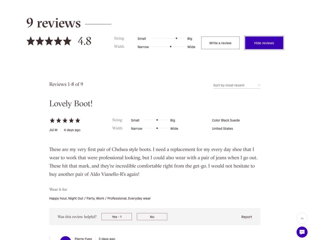
5. Ratings, Reviews, and Social Proof
When a user is on their shopping journey; ratings, reviews, and social proof are their best friends. No matter what ecommerce platform you’re using, make sure that you’re able to accommodate reviews. Not only do these components build trust with new audiences, they can also guide customers in making decisions and in many cases, help answer questions that otherwise may have resulted in a customer service inquiry that may not get an immediate response. In addition to reviews, social proof can go a long way. This might include instagram posts or tweets from your brand community that talk about how much they love the product.
Tip: When you have enough reviews to showcase, include the average number of reviews at the top of the page with an anchor link down to the reviews section. This is helpful to bring to the forefront for customers and provide easy access when shopping.
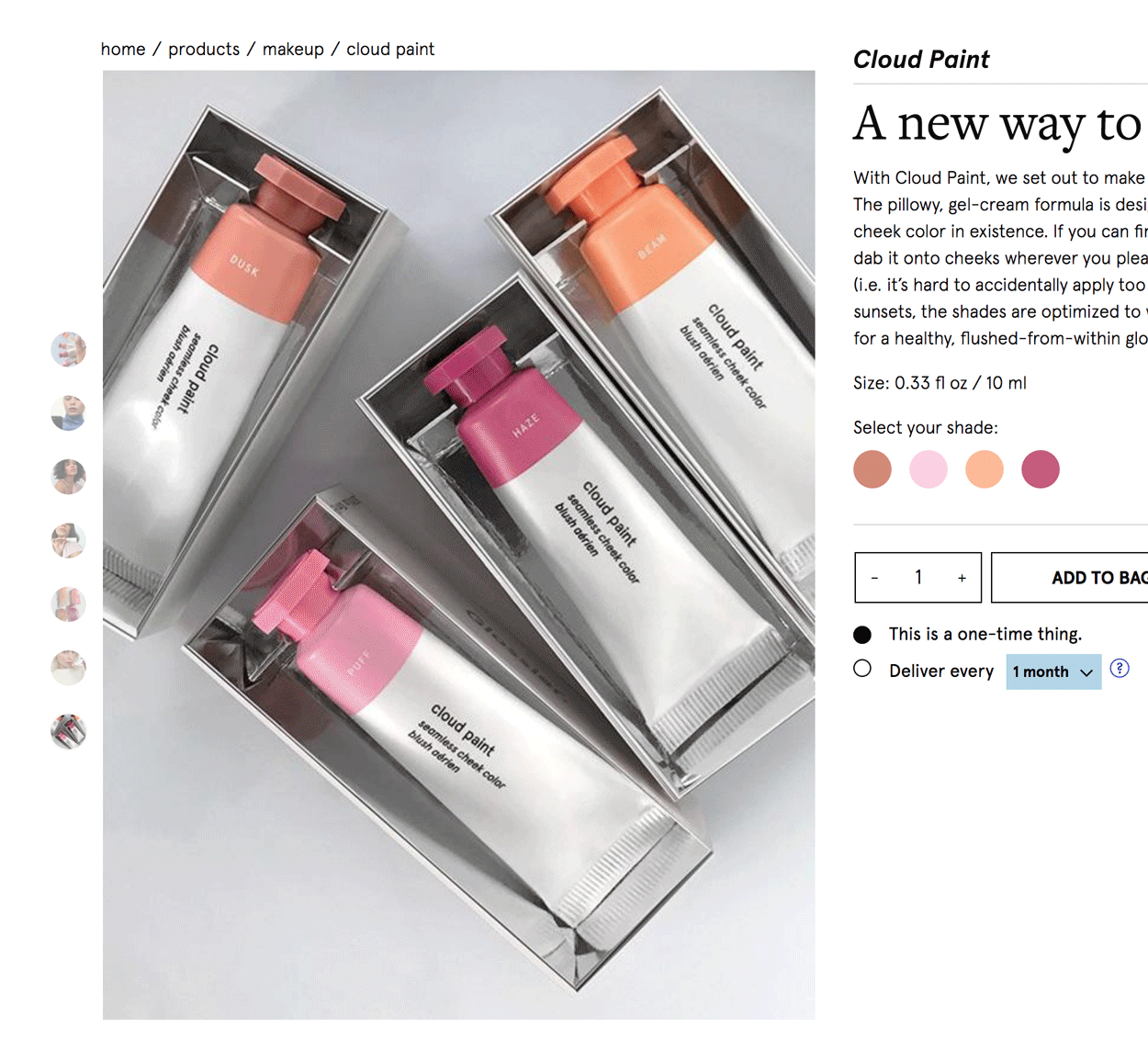
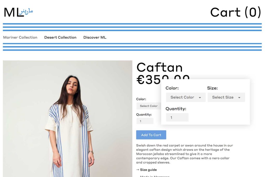
6. Familiar UI Selections
Depending on the type of product you’re offering, there may be a need for drop downs or select boxes to change quality or choose things like color, size, and other variants. No matter how bold, or funky your brand’s look and feel is – don’t reinvent the wheel! When a customer is in the process of shopping and researching, the last thing they want to do is figure out how to select a size or increase the quantity.
7. Value Props on Display
What about your offering provides value to your customers? Whatever it is, make sure it is on display right near the “Add to Cart” button and/or prominently on the page. This includes callouts like: Free Shipping Over $15, Money Back Guarantee, Free Returns, Lifetime Warranty.
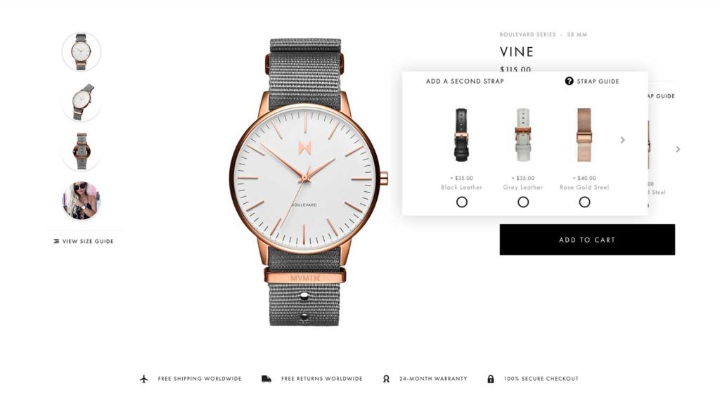
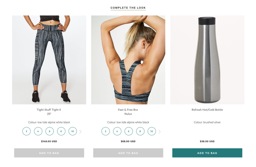
8. Enticing Cross-sells and Upsells
Cross and upselling products is a very important tool to helping customers find more of your products and/or pair products together. You can think of this much like the way in-store experiences are often set up. For example, up-selling a 2-pack of toothpaste at a discounted price or cross-selling paper towels in the cleaning products aisle. To get more specific:
- An upsell is recommending a more expensive or higher-end version of the product in question. You can think of it like an upgrade. For example if Apple were suggesting that the customer should get the 32GB phone rather than the 16GB. Fun Fact: When Amazon.com introduced the upsell to in 2006 (e.g. “customers who bought this item also bought”), they reported that their sales increased by 35%.
- A cross-sell is recommending complementary items that go with the product they are buying. For example, suggesting a tie that pairs nicely with the shirt in question, or a protective phone cover with that 32GB phone (e.g. “Pair With”, “You May Also Like”, “More in this collection”). Tip: Adding a “Quick View” to cross-sell products provides an outlet for customers to add more products to cart without ever leaving the product page.
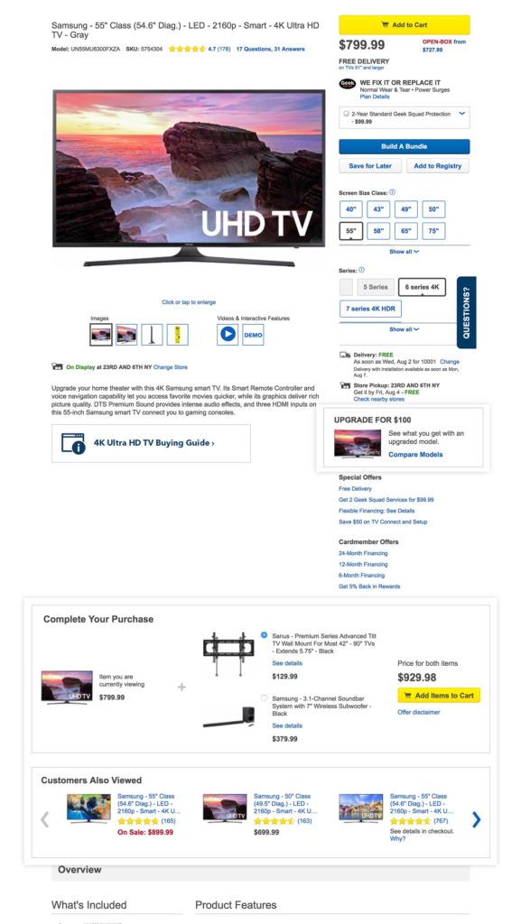
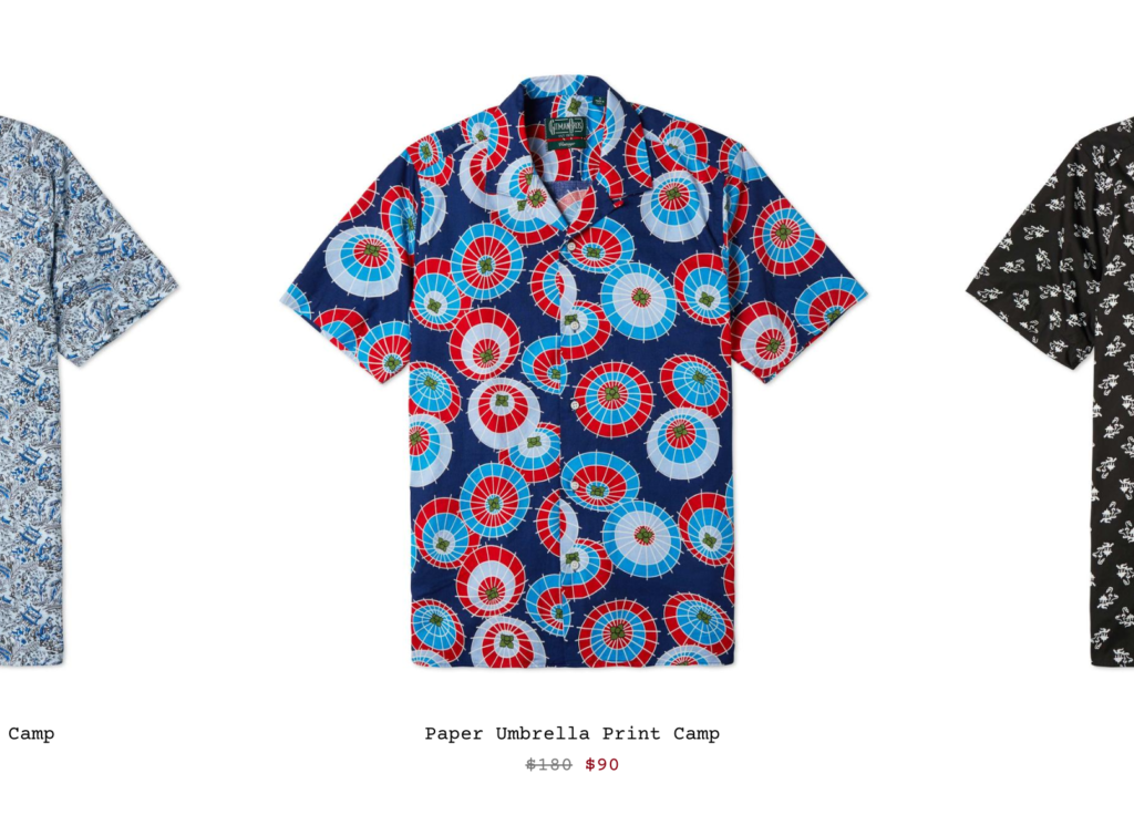
9. The States of Price
Make sure your price is in a place where it is visible. It is recommended to keep it right below the product name. If the price is not in view when the “Add to Cart” button is on screen, repeat the price next to the button or right inside of it. For products at a lower price point where higher quantities are likely, the price near “Add to Cart” can increase as quantity goes up so the customer knows exactly what they’ll be paying and won’t have to do the math.
While it may not be relevant for all brands, don’t forget about the ways price can change:
- Sales: Sale styling is very important during key parts of the season. Rather than simply discounting the price, make sure to show the original price crossed out next to the new price. This helps customer understand the savings they are getting.
- Sold Out: What happens to the price when merchandise is sold out? If the product may come back in stock, make sure to keep the price visible along with a “Sold Out” label.
- Additional Savings: Some websites discount products even further after a sale. Rather than showing 3 prices like a sale rack and risking confusion, keep it simple and add a label so customer know they’re getting additional savings.
10. A Visual Callout
Outside of your product description, include at least one visual area to speak to the brand story, product story, quality, and/or product features. While some of this content may be covered in your product description, this is a more visual and prominent placement to highlight what makes your product unique.
You’re All Set
Now you’re officially equipped with the tools to create or enhance your product page experience to increase ecommerce conversions. If you have an existing site, do an audit to make sure you’ve got everything covered. If you’re starting from scratch, don’t forget to check off each of these elements as you begin building out your product page template. Here’s a quick recap:
- A Descriptive Product Name
- A Prominent “Add to Cart” Button
- Strategic Product Photography
- An Informative Product Description
- Ratings, Reviews, and Social Proof
- Familiar UI Selections
- Value Props on Display
- Enticing Cross-sells and Up-Sells
- The States of Price
- A Visual Callout
We help our clients improve their product pages and enhance the overall e-commerce experience for customers. Learn more about Barrel and the work we do for growing brands.