Reporting on the recommendations and campaigns we put into action is a large part of servicing clients.
We’ve streamlined our reporting by switching to Google Data Studio and building customized dashboards for our clients.
Google Data Studio saves us time on gathering data and allows us to pull out actionable insights for our clients.
Here’s how.
Visualize Data Better with Google Data Studio
Google Data Studio is an easy and effective way to automate reporting.
Google Data Studio gives users the ability to have consistent formatting and clearly show performance and how it’s trending over time without having to re-access the same data every week or month.
Once a data source is connected and a report is built, the visualization continually updates as the data does.
As an agency building reports for many clients, this saves us time pulling data and makes it easier to find actionable insights.
We see so much value in a well-constructed dashboard that we often include a custom Google Data Studio build as a feature of our Google Analytics audit & implementation.
Google Data Studio paints a bigger picture for its users. With a holistic view of all sources and clear visualizations of trends, users can make data-backed business decisions.
Let’s walk through some examples.
Unique Features of Data Studio
Google Data Studio is filled with features not available in other data reporting platforms.
With Google Data Studio, you can:
- Combine data sources
- Build custom formulas
- Apply unique filters
- Set custom data comparison ranges to benchmark against.
- Adjust the visualized date range and device type
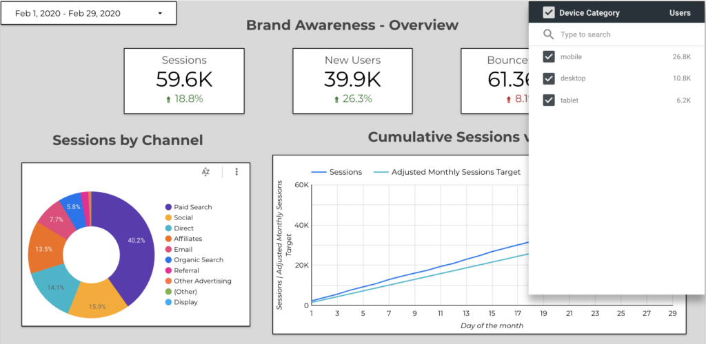
Why are blended data sources so important? And what platforms can you combine data from?
Google Data Studio allows you to use data from any of Google’s data and ad platforms (Analytics, Ads, YouTube Analytics, Search Console), as well as more customized data sources like a Google Sheet or MySQL.
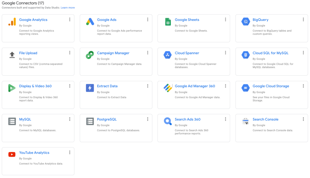
You can also bring in data from Facebook Ads, Amazon Ads, Bing, Asana, Ebay, Hubspot, and MailChimp (just to name a few) through third party platforms like Supermetrics or Power My Analytics.
Clean Views of Performance Over Time
Looking to report on performance trends? This simple set up easily shows the difference in ad performance week by week.

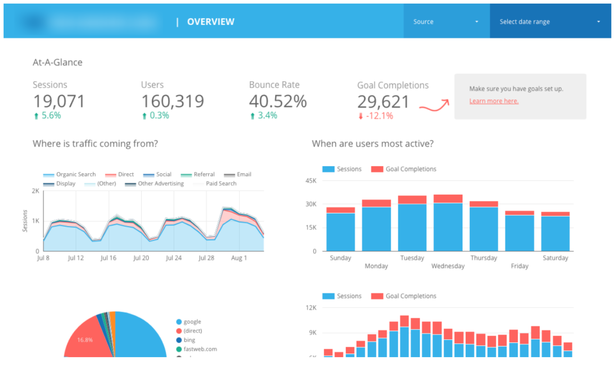
Google Data Studio has multiple visualization options to make performance data digestible for anyone.
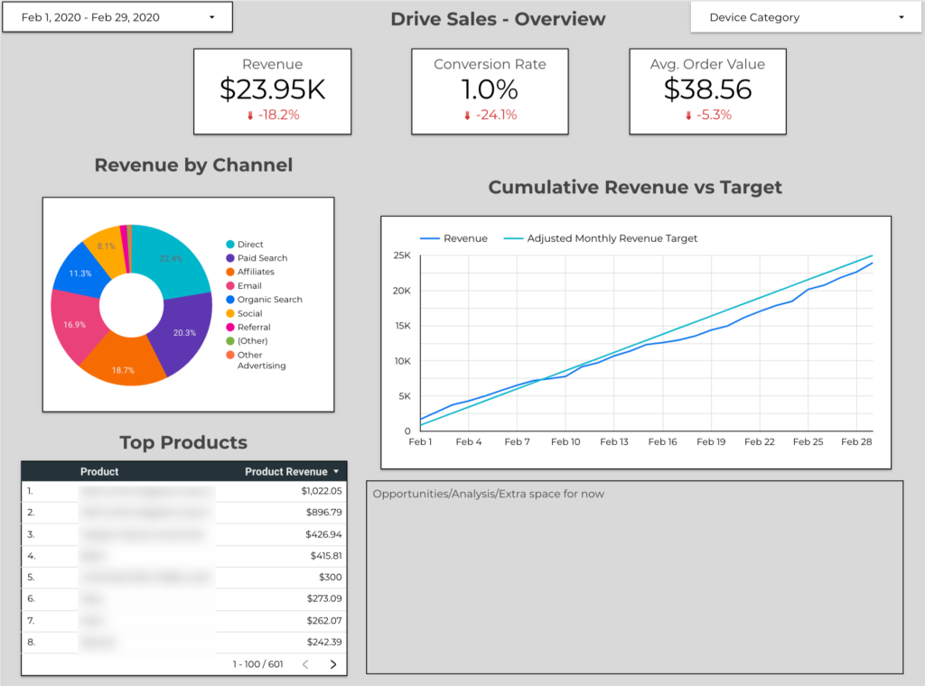
Google Data Studio allows you to map out revenue targets. You can track performance against targets without having to manually update any graphs or input data into sheets. It’s automated, and can be set months, quarters or even a year in advance.
Using blended data from a variety of sources means you can step up your visualizations, reports, and insights.
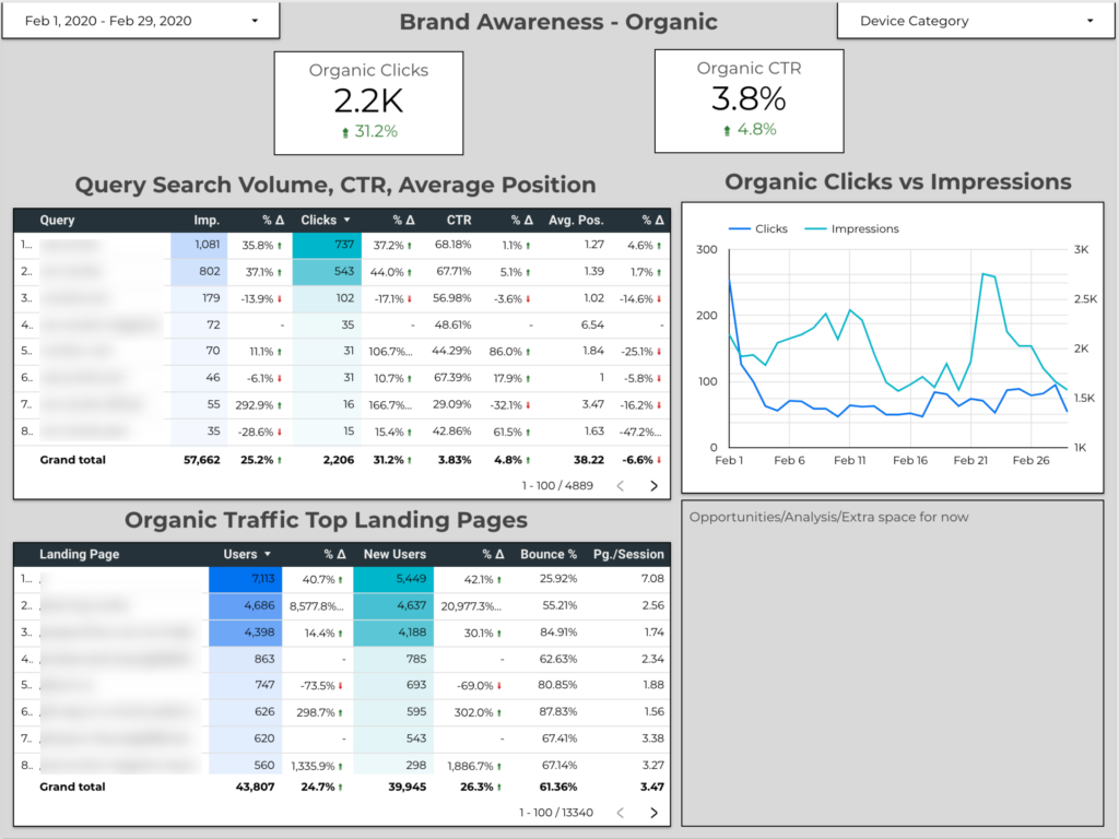
The example below combines Search Console information with Google Analytics data to produce a comprehensive view of how organic acquisition is performing period over period by keyword and landing page. This side by side view makes it clear that the optimizations we made on those top three landing pages massively improved the user experience, search ranking and performance on search engine results pages (SERPs).
Visualization That Make Insights Easier
Data reporting is about more than showing trends and monitoring campaign efficacy.
A well put together dashboard with blended data sources and custom formulas, metrics, and dimensions adds gasoline to your marketing fire.
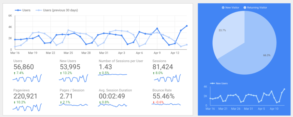
You can still bring in key data visualizations from Google Analytics, but can layer in metrics from different pages within GA to put all the information on one page.
In the image above, we see traffic numbers are down month over month. Maybe that’s all we’d focus on if we were just using Google Analytics.
However, this Google Data Studio visualization highlights additional insights:
- The traffic drop is mostly from a span between March 12 and March 19 where traffic was particularly low. Once you take into account that an entire week was low, we see the rest of the traffic was on pace with the previous month. This looks more like an outlier than anything that needs to be worried about, especially because we saw user count rebound the following week.
- We also see that traffic follows a consistent cycle of peaks and dips every week. Looking at the actual dates and days of the week, traffic is down on weekends. From this, we can discuss doubling down and leaning into marketing on weekdays, or ways to boost weekend traffic. Then we can cross reference with conversion data to see if weekend traffic is higher quality or lower quality.
In only a few minutes of work, we noticed a unique traffic pattern and discovered that conversion rate drops on weekends despite having lower traffic numbers.
We now have the data to recommend increasing ad spend on week days and cutting it drastically on weekends.
With customizable reports, the ability to combine data sources, and enhanced visualization options, Google Data Studio speeds up reporting and puts all key data in one place so you can look for actionable insights.
Data-Driven Marketing Within Reach
It’s no longer just massive companies that can collect and use data to make informed decisions.
Google Analytics was the first step to make this accessible to all. Google Analytics revolutionized how users identified trends and found insights from data related to website traffic.
But Google Data Studio compounds this by enabling you to minimize the time and effort needed to dive into data and tie insights from multiple sources together for actionable, data-backed, recommendations.
So if you’re ready to cut steps out of your reporting, and supercharge your Google Analytics, make the step to using Google Data Studio.
1 thought on “Upgrade Your Reports With Data Studio”
Comments are closed.